Tag Archives: Design

Akismet—Was it Fate?

Stemming the Onslaught of Spam

When I started this blog, I researched before taking certain set-up steps. WordPress encouraged Akismet as a spam-blocker and JetPack as a good assortment of plug-ins. Because I encountered many “pro and con” discussions of both items online, I decided to wait before installing either one.

Intro Key

As a result, I soon became inundated with spam comments … and the volume kept escalating. Within a short time-frame today, I accumulated 127 spams and they were cumbersome to delete. Rather than go far afield in researching Akismet alternates, I looked at only the one that sounded like the best option. It was controversial too, subject to bugs and difficulties. So I went ahead with Akismet.

I have a couple of library books checked out about WordPress. As time allows, I’ll delve into that information to learn how certain other plug-in components can help this blog … because it’s pretty bare-bones at the moment, which also means pretty hidden. For now, though, that’s fine with me.

By the way, the top definition of “kismet” that appears in a Google search is “destiny; fate” and the usage example given is: “what chance did I stand against kismet?” I conclude that the Akismet software is aptly named.

 ~Jo  

P.S. I wish WordPress offered a plug-in that would keep the paragraph font from going wacky sometimes and appearing more bold or condensed. (Sigh.)

P.P.S. It has now been a full day later and I have NO spam comments. Ahhhhh-kismet!

Photo Credit: “Intro” key cropped image from Alvimann at morguefile.com.


The Mechanics of Work

L-Lobo Designs

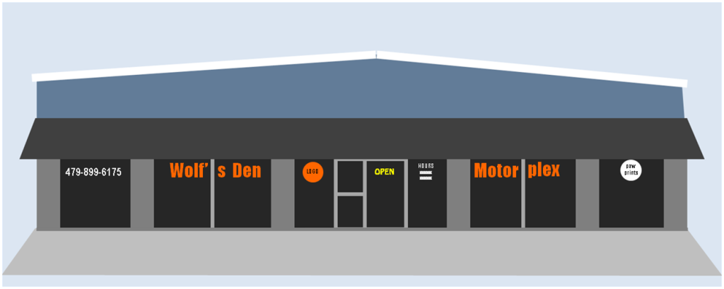
Yoicks! Who’ve thought? Ethan has been “swamping” at the mechanic’s these last few weeks and I’ve helped out, too, with graphics. My offer of a plan for storefront signage turned into a chance to do the signs. Then our joint involvement brought an opportunity to design t-shirts and other items for the gift shop … maybe maybe even to run the gift shop..

 L-Lobo Designs logo

So Ethan and I have been discussing the opportunities and risks. I’ve been researching the sorts of things that are sold in motorplex gift shops. And today I took time from some tax accounting to play around with a business name and logo.(It was quite a challenge to find a name that wasn’t taken.) Anyway …

Look what life lobbed to me: a LOBO LOGO project. What fun!  ♥ ~Jo

* * *


Favorable Weather for Lettering

The Poet Writes Large

For over a week, the weather here has been extra cool and wet. Today started off rainy and the high was in the mid-90’s. That worked in my favor as I labored outdoors applying vinyl letters and graphics to a storefront. I don’t have photos of the process but can share the proposed design I gave to the owner:

Motorplex signage design

My husband’s mechanic friend is starting a shop of his own. When I first visited, the only signage was a small banner, barely visible from the highway. I expressed concern about James’s business being overlooked for that reason, and Ethan said, “If you can come up with something better, why don’t you make a proposal.” Long story short, James agreed to my design suggestion and even invited me to do the work.

I wasn’t going to turn down an opportunity like that, even though I’m not a professional signmaker. I bought the vinyl, made the patterns, cut the letters, and planned the installation. Today the installation took almost six hours. I was learning on the job … and I loved every minute.

Solving craftsmanship issues was the most satisfying … how best to clean glass, make measurements, position graphics, use tools, etc. After a few ruined letters, I learned to wet the surfaces and properly use a squeegee. Another important lesson was that the orange vinyl, being translucent, lost brightness when removed from its white backing and placed on a dark window. Also, letters that looked enormous at close range seemed smaller than expected at a distance.

How appreciative I am to James for entrusting me with the work and for showing his delight when it was done. I got a big thumbs up … and a big hug too.

DREAMING ON

If I had my druthers,
I’d play at work all day,
designing entertaining things,
for those who’d want to pay.

And, to find these others,
I wouldn’t have to shout,
or pay for ads, or dance and sing,
for they would seek me out.

I had a red-letter day awhile back when I started this blog. Today was an orange-letter day. I took advantage of fun opportunities to write both large (the signage) and small (this blog). Very satisfying. ♥~Jo

* * *

Test to Resize Photo

Poem 130623 Onboard Guidance

I think I’ve solved the size problem. But now the picture is fuzzy, whereas the original is not. Why isn’t this photo as clear as the image you get if you click on it and it opens in another window???

Still struggling. There is SO much to learn, in spite of WordPress and YouTube tutorials that claim setting up a website is easy. For example, the information on backing up data is prodigious.

Blog Post Sequence

This is my third post today as I experiment with how WordPress works. The first two posts appeared on the page in reverse reverse order. In other words, the second post was not in the expected reverse chronological order, which would have been higher on the page. Instead, it appeared lower on the page than the first one.

Maybe the solution is to only post once per day. But, out of curiosity, I want to discover whether this third post will appear at the top, middle or bottom of the day’s postings.

I am relying on other people’s advice to learn and sort out these oddities, and I hope my experiences will someday be useful to others as they learn.

Result of this test: The posts I made today in the sequence 1-2-3 appear on the page in the order (from top to bottom) 3-1-2. Dunno why.

Webpage Photo Quality

Poem

Illustrated Poem of 6/23/13 


Test Two – Inserting Webpage Photos Without Losing Quality

Things are easy AFTER you learn how … in this case via some kind soul on a YouTube video.

Next I want to learn to have more control over how things get displayed on the website pages, e.g., more font size variation, different placement of text such as in extra columns, etc. Things have sure changed sine the ’70s when I wrote my own HTML. I guess the harder a problem is, the greater the thrill of solving it. As far as WordPress goes, I’m still probably in the foothills. No telling how big the mountains will be.


Guidance for the Launch

Poem 130623 Onboard Guidance

Illustrated Poem 130623

I feel drawn, lately, to launching this website and have asked my heart for guidance. There is so much to learn about these processes–both the design software and the heart intuition.

This poem was written this afternoon. The color scheme turned out more dreary than I’d prefer. I wanted to achieve a “luminous night” color scheme that coordinated with the dusky rose heart-moth, and also to rely on copyright-free source materials. I may have another go at it later. I also need to figure out how to import pictures that retain their original size and clarity. I think you can click on this one to enlarge it.

The moth photo is courtesy of Puravida: http://www.morguefile.com/archive/display/105471